

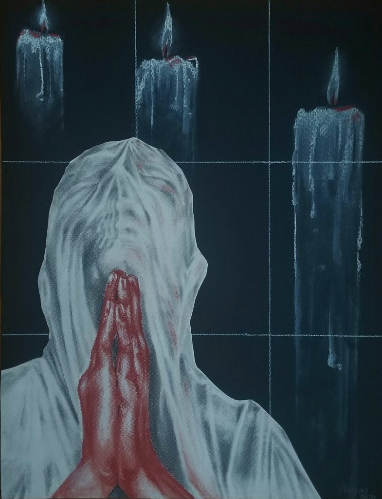

Inspired in style by modern figure artists Mircea Suciu and William Kentridge, I chose to portray the gravity of modern religious intolerance, focusing specifically on the current persecution of Christians in the Middle East. I referenced a combination of found images of those affected among works of the mentioned artists. Much of Suciu’s work involves apparition like backgrounds, shadow filled fabric, and stark hiding faces. Both Kentridge and Suciu have mostly greyscale color palettes with effective pops of a color, along with strong underlying socio-political context. The two pieces shown utilize these qualities, but in contrasting manners. This parallel is emphasized by the inverse in base color of the pieces as well as their orientation. Despite such, I’d like to think neither piece is more to one artists’ likeness than the other.
*The text is an excerpt from the New York Times regarding the drastic decline in Orthodox and Maronite Christians due to organized violent oppression, in the lands of the origin of the faith.
Melina, I wonder if the imagery conveys this religious persecution clearly. I do see the mother and child and am not sure what she has slung across her shoulder, and I am guessing that is an Orthodox or Maronite cross on the broken pillar? but it feels more like the war torn Middle East. So I am missing the reference to religious persecution. The veiled woman crying out is very effective, are the three candles significant? they diminish in size but not in detail and I wondered why.
I will confess I know very little about Maronite Christians, but was aware of their persecution, particularly in Cyprus.
That said, both drawings are very expressive and use the different artists’ sensibilities well.
I really love your works, especially the second piece. The choice of red and dark blue creates a very outstanding contrast. The way you handle the candles showing they were fading as they move further also enhance the entire atmosphere of the work. I also admire your technique of portraying the face and the piece of fabric covering.