I did the first drawing on the textured side of dark gray drawing paper using oil pastels. I drew from a photo of my friends hanging out, the drawing took about 6 hours. I regret using the textured side of the paper because it made a lot of edges really sketchy and made it challenging to get small details well, so I used colored pencil for certain fine areas, like some facial features. I like the way I did the light and I think I did a better job on the figure on the left – I think I got the shadows and lighting well on him. The figure on the right was a lot more illuminated because he was right next to the light but I think I made him too light in comparison to the guy on the left. Some of his proportions are off, I made his head too big and his feet too small.


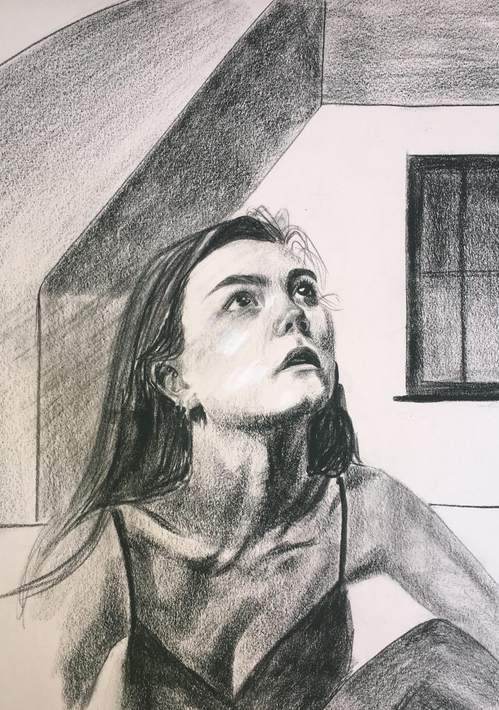
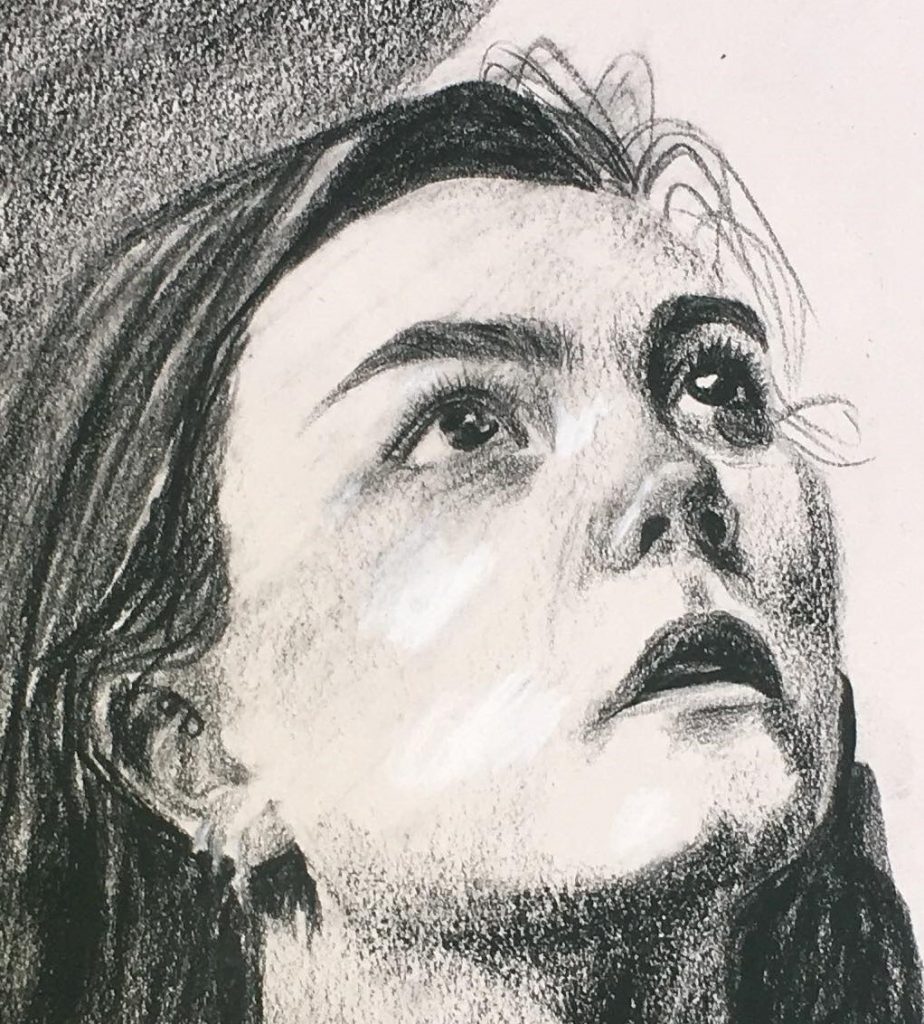
The second drawing is of me in my room and I did it with conte crayon on newsprint in about 2 and a half hours. I intended for it to be expressive, I wanted the face to be a lot lighter than the rest of the body and I wanted the background to be kind of simple and confining compared to the figure. I think I could have done a better job of achieving those things and making the face more of the focal point like I wanted. I think it successfully looks like me but I struggled with the nose and jawline – they could definitely be improved.

Siânin, the figures in color are very effective, yes the head and feet on the lighter figure could have been a little more proportional, but the color and overall rendering of the forms make them very convincing. Perhaps the contrast on the light figure might have been a little stronger (the top -lighter and under his leg-darker for instance). But we all admire your use of color and light as a composition it is very striking. At first i felt the ambient light to strong but on reconsideration it all works well.
The self portrait is compelling, it is a hard angle to get the jaw absolutely correct. Look back on my powerpoint on portraits, particularly the Bridgeman illustrations. They might help. In future try to avoid both lines and tone in the background if you want the emphasis on the figure. Or fade your lines more. You don’t need them in the architectural details of the room, next time sketch it in with a light graphite pencil or vine charcoal then think of them as edges, edges of light walls or edges of shadowed walls. Keep up the good work.
I love both of these. You are so talented! I love that you used oil pastels, which we haven’t used in class. It is refreshing to see how lively a figure can be in color. The shading in your self portrait is really impressive and detailed, as well as really accurate proportions since it looks exactly like you. So good