
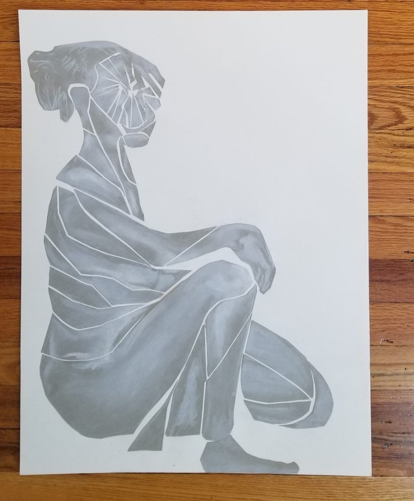
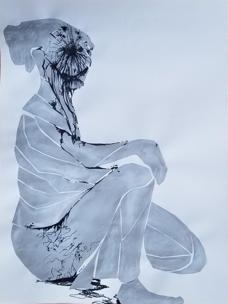
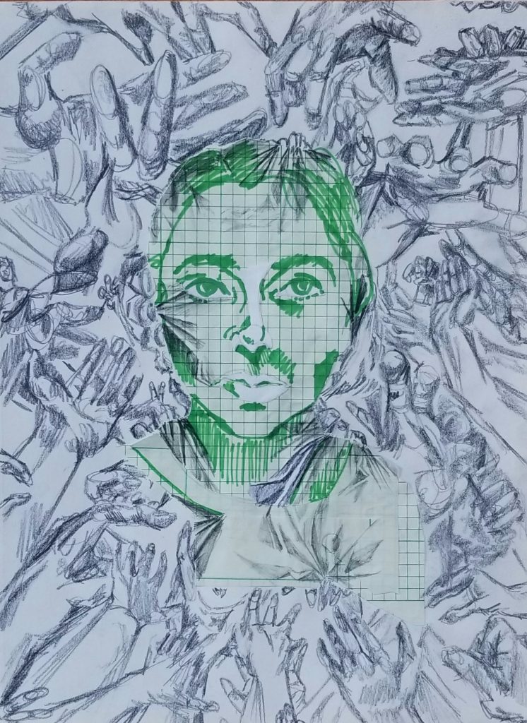
This first image is a reconstruction of a model we had worked on in class. I wasn’t pleased with the original level of value or detail, and created a more collage like piece. I was inspired by artist Simon Berger. The progression is shown from the original rendering on grey paper to the final with black marker additions (18×24″, 20mins + 2 hours)
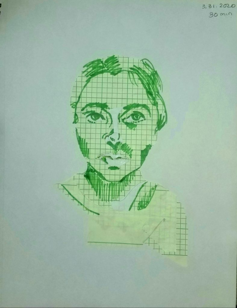
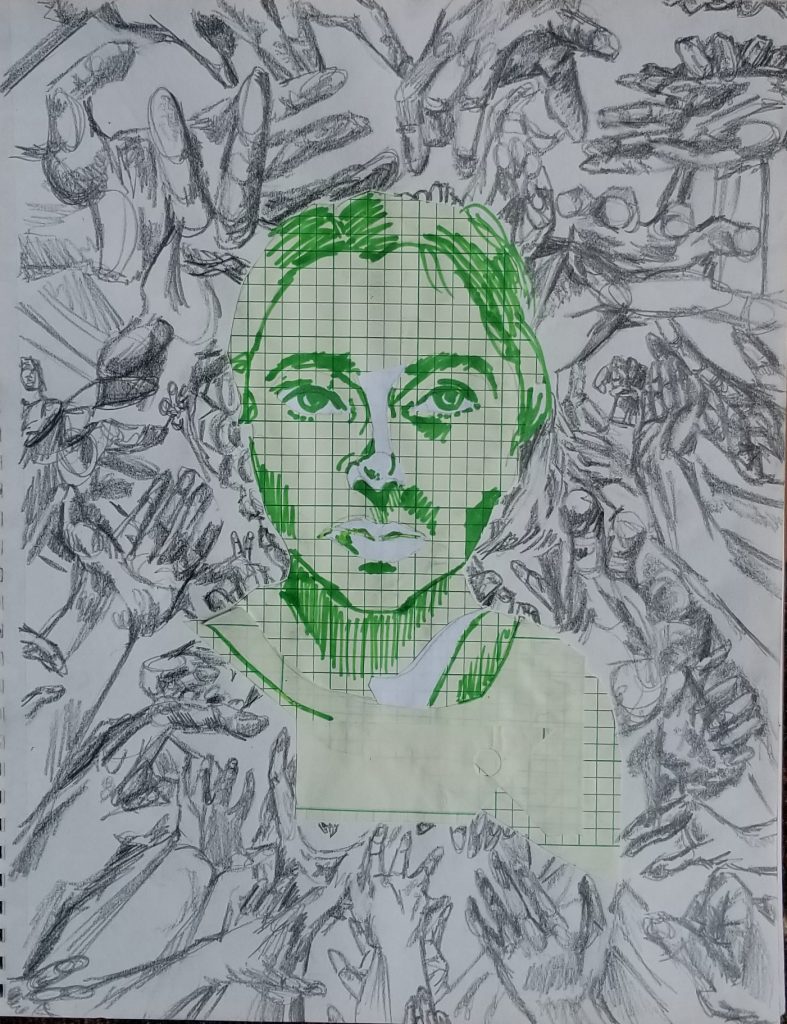
This piece was the first collage I made in this class in my sketchbook and I felt the expression of the image would be more effective with more context. Additions in graphite (9×12″, 30mins + 1 hour 30 mins)
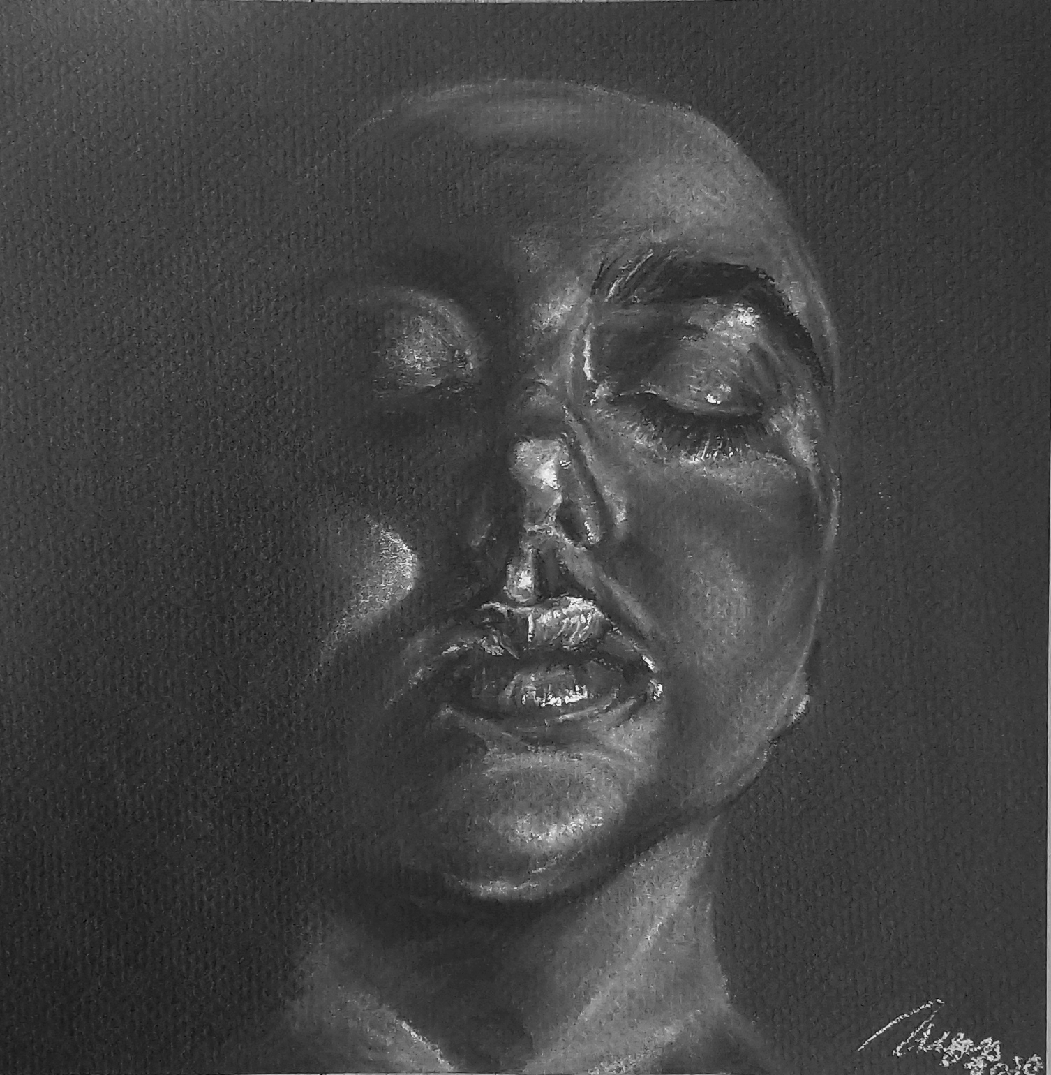
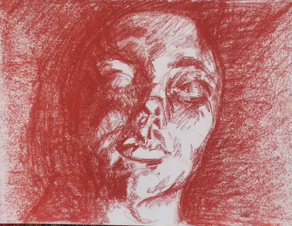
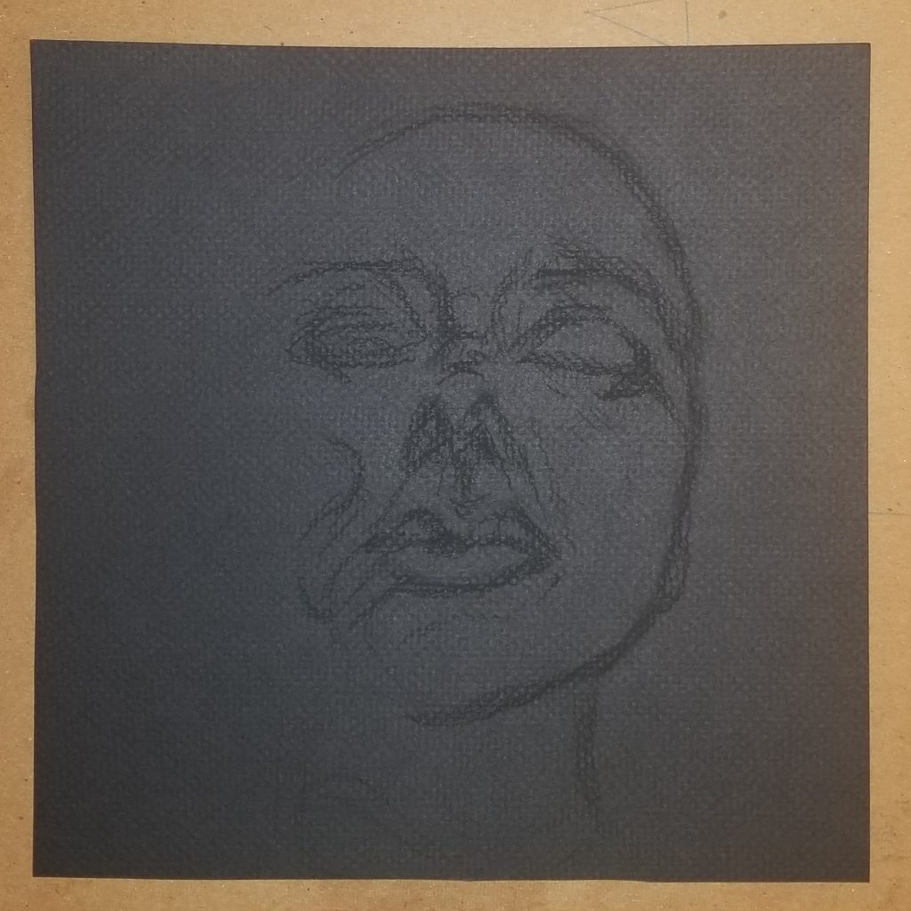
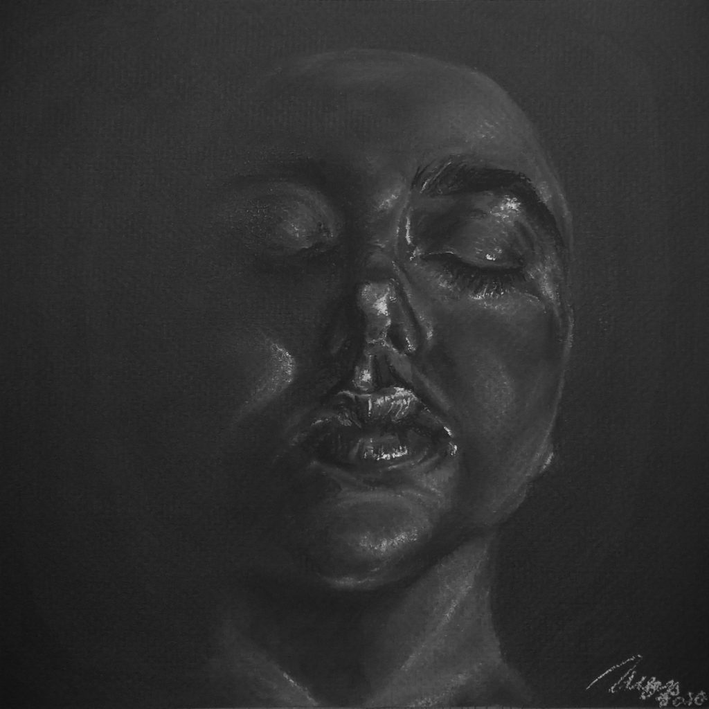
My original red conte drawing was in my sketchbook, rushed, and not an effective depiction of the depth and severity of the reference photo I was using. As much as I hate making self portraits, I appreciated the photo and thought the best thing to do would be to completely start over on black paper and work negatively. The finished piece is in white conte (OG 9×12″ 20mins, FN 9×9″ 2 hours 30 mins)
These three pieces really comes together to create quite an eerie series of drawings. In the first one, I liked how you used abstraction/cubism but still kept the figure recognizable. Then the addition of the dripping ink on top really draws the viewers in and feels like it’s straight out of American Horror Story. The second piece, I like how you overlapped some hand drawings into the face to create that claustrophobic feeling. It definitely feels more complete and captivating. It makes me stop and look at the drawing for longer than the original sketch would have. For the final piece, the decision to work from dark to light values really pays off. The final outcome looks amazing! It has a very successful wet/shiny quality to it and I can see now that it is a face half submerged in water versus in your original sketch I just read it as a face with a harsh light shining on it from below.
I really like how you used tone in the first image, it seems like the figure is floating in water. I also really like how crowded the second image is, the color of the pen emphasizes that she is removed from all the hands in the background which makes it seem like they are reaching toward her rather than being 100% in her space.
I like the way you reconstruct your first piece, and present it in a more expressive way so that it is no longer only a portrait but also showing some emotions. The technique on the third piece is very impressive, especially how you use the white conte crayon. The white conte crayon portrays both the detail of the highlight and the surface of the face, which makes it very close to the texture of the skin. The textures of the lips and eye lids are great as well. I personally found difficulties drawing this angle of the face because of the perspective and proportion, but you did a good job at it.