
This portrait took me about 3 hours, and I used only blue and white colored pencil on grey toned paper. Initially, I wanted to just use blue and have a mostly lightly and gently shaded face, but I didn’t think that there was enough contrast, so I added the white and made the darker tones heavier to exaggerate the contrast and tones. I like how this turned out, I think that the proportions are pretty correct, especially on the left side of the face, because I redid it so many times until it looked right. I dont like the way that some of the colored pencil marks look when the two colors were layered, but I dont typically use colored pencil, so it was good practice.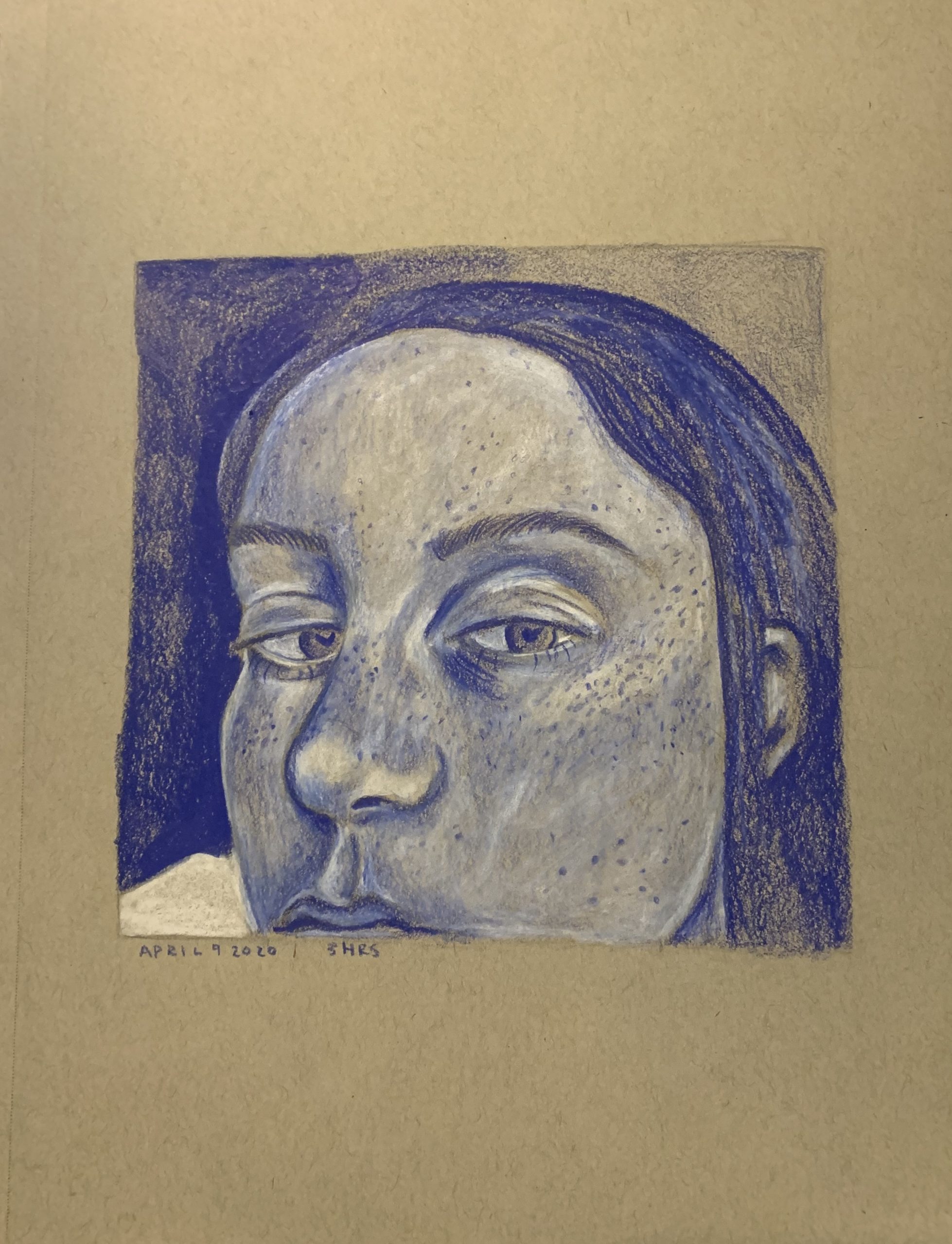
2 thoughts on “Self Portrait”
Leave a Reply
You must be logged in to post a comment.
Ella interesting that you cropped your face at the mouth, good proportions, interesting tonality, very expressive. As for colored pencils, they are difficult to blend and work best when used lightly and the paper tone comes through as in your forehead and nose. Keep experimenting, but this is very successful.
What an intriguing choice of colors! At first glance I thought you had used a blue ballpoint pen, but after reading your description I can see it’s color pencil. I think that it was a super smart choice to add the white to bring out the lighter values from the toned paper. I also like your attention to detail by adding your freckles. The way you cropped the face also adds interest whether that was intentional or not it works really well.