
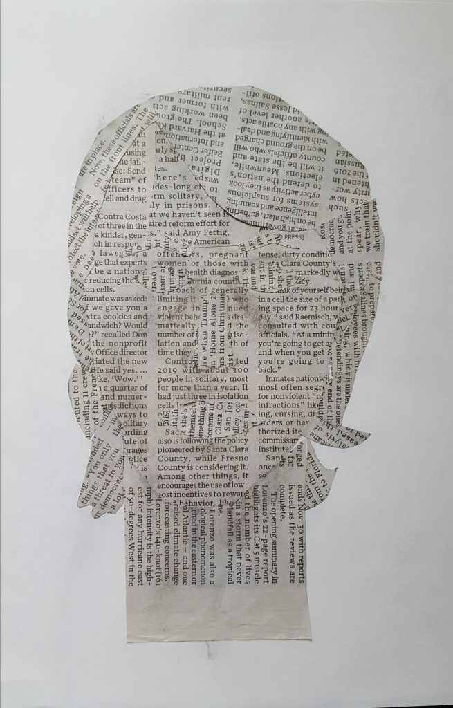
This was my first time doing collage and I wanted to challenge myself a bit, so I limited my materials to newspaper and charcoal.
This took me about three hours in total, since I was limited in material, I tried to change the direction of the text so indicate different shapes of the head. (Eyes, nose, hair, etc)
When I do this again (and I think I will) I’d like to make better distinction between the shapes, maybe change the size of the text to indicate different parts of the head, and I’d like to better integrate the text into the face to make it feel less flat.
Lucy suggested I should angle the text according to the planes of the face and I intend to do so in the future.
This turned out really well for your lack of materials. I wouldn’t have thought to change the direction of the text for the different shapes and I think that that was the right move!
Ian,
I thought I had commented on this earlier, so sorry. Good choice of materials, what if you drew back into the collage, just lightly to create a valeu difference between features and face, very nice subtle toning under the chin and in places on the face.