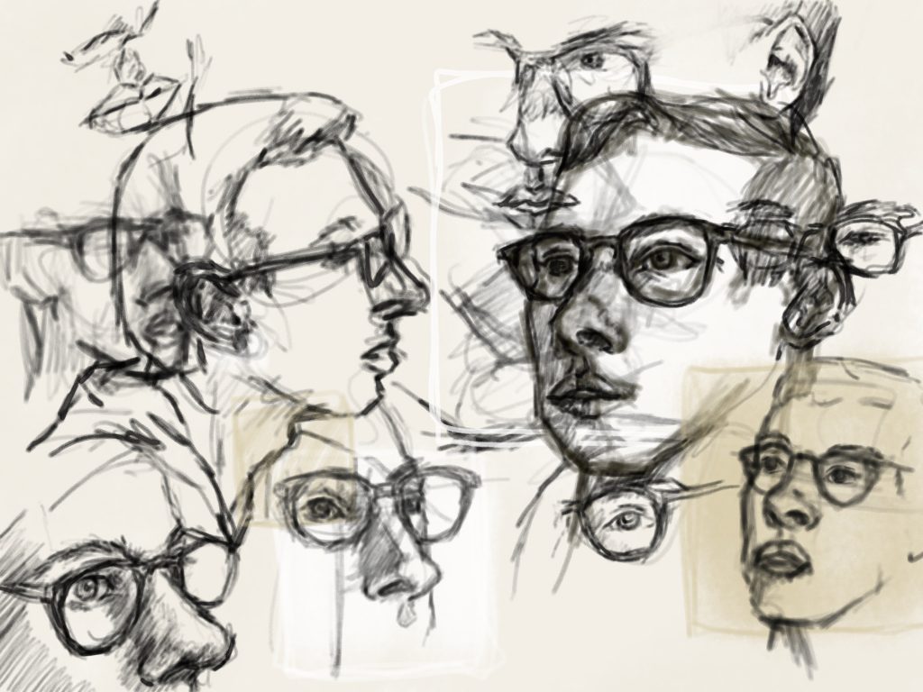
Hand Line Contour Abstraction Digital Drawing: 1hr Face Pileup Digital Drawing: 3hrsGet my ‘Good Side’ Digital Drawing: 2hrs
3 thoughts on “Abstraction”
The hands are very striking, the color the composition and the implication of movement. Some of the colors advance and some receded so it gives us a kind of spatial ambiguity. The face pile up would benefit from more tonal contrast in the line work, and more light and medium tones or lines so the layering doesn’t just get darker.
My good side works well as well….I particularly like the tonal windows as if they were overlaid but again try for even more line variety. There is nice movement from bottom left figure to middle left figure, I think there could be and even lighter treatment of one of the faces. Can you save these as digital files and work back into them?
In the first piece I love love your use of color! It brings so much movement to the piece. In the other repetition pieces there is such a great preservation of expression and emotive quality to the faces
I really like the variety of color and line width in the hands piece. I also like the shape of it moving across the page, the combination of hand positions with that orientation creates a lot of movement.
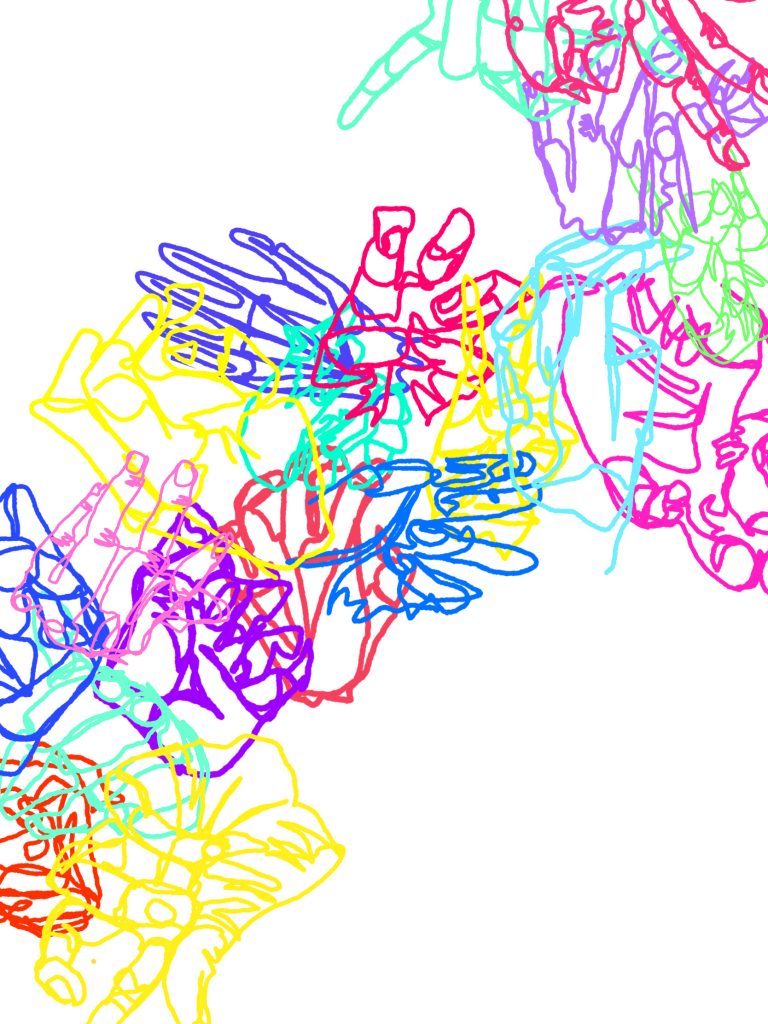
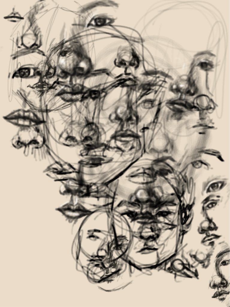